5.1. Overview dashboards
Overview dashboards provide a high-level view of network activity across all services, locations, monitoring points, and protocols. These dashboards are the starting point for analysis, helping you identify trends, outliers, or potential issues before drilling down to a Detail dashboard.
Dashboard structure
Each Overview dashboard includes:
Key metrics
Metrics table
The key metrics provide a quick view of top values for the selected time range, showing the highest server latency, highest connection failures, and the top 10 by throughput.
For Services and Locations, connection failures represent inbound failures. For Monitoring Points and Protocols, total connection failures are shown.
The metrics table lists all active services, locations, monitoring points, or protocols for the selected time range.
Direct navigation links
Values in summary panels and metrics table act as direct navigation links. Selecting a value opens the corresponding Detail dashboard, with the current context preserved, including the selected time range.
Layout and components
The following example shows an All Services Overview dashboard and its primary components.
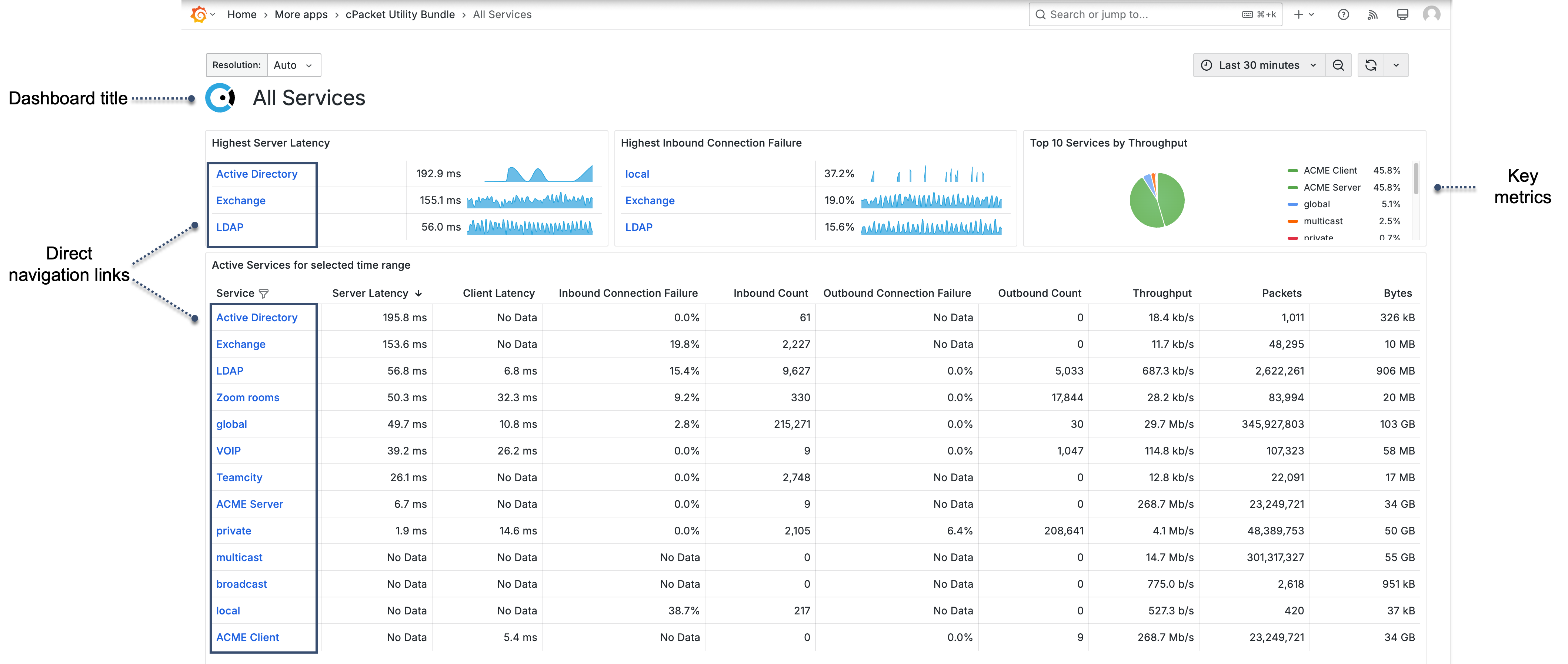
- Dashboard title
Indicates the dashboard scope, such as All Services, All Locations, All Monitoring Points, or All Protocols.
- Summary metrics
Shows key values for the selected time range.
- Metrics table
Lists all active services, locations, monitoring points, or protocols for the selected time range.
- Direct navigation links
Values in the summary metrics and table link to related dashboards.
Metrics
Services and Locations display the following metrics: Server Latency, Client Latency, Inbound Connection Failure, Inbound Count, Outbound Connection Failure, Outbound Count, Throughput, Packets, Bytes.
Monitoring Points and Protocols include: Server Latency, Client Latency, Connection Failure, Connections, Throughput, Packets, Bytes.