4.2. Explore the data
The metrics table is the primary tool for exploring your data. You can change what the table displays, sort and filter its contents, compare metrics in the graph, and navigate to related dashboards.
4.2.1. Change what the table displays
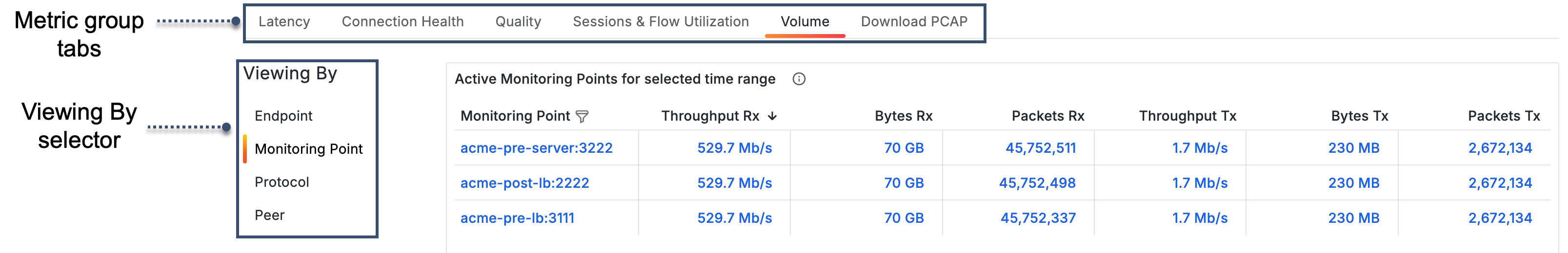
Detail and Conversation dashboards include two additional controls for defining what the table displays: the Metric group tabs and the Viewing By selector. These controls work independently but are used together to define exactly what the table shows. Neither control affects the graph. To change what is displayed in the graph, use data links. See Compare metrics in the graph.
Metric group tabs control which metric category is displayed in the table columns. Click a tab to switch the table to that category. The available tabs are Latency, Connection Health, Quality, Session & Flow Utilization, and Volume. For a full list of the metrics available in each category, see Metrics by group.
The Download PCAP tab is also available in the tab row. It is described in Download PCAP.
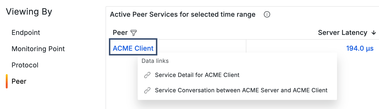
Viewing By selector changes the perspective of the metrics in the table. Click a tab to switch to that view. The available options vary depending on the dashboard type. Some views correspond to the analytics label categories configured in cClear, such as Services, Locations, Monitoring Points, and Protocols. Endpoint and Peer provide additional ways to organize the table based on the selected dashboard. Peer views show the other side of the communication for the selected item.
The following example shows the Metrics tabs and Viewing By selector on a Detail dashboard.
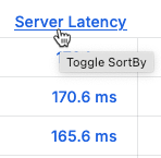
4.2.2. Sort by value in table columns
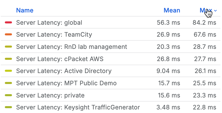
Click a column header to change the sort order from default to ascending to descending. Each time you click, the sort order changes to the next option in the cycle.
4.2.3. Filter by column
Filter within the table to display only the values you are interested in by selecting one or more values.
Click filter
 next to a column title.
In the search field, type the string to be matched or select one or more values from the list. The input type is based on the selected category.
Click Ok to apply the filter.
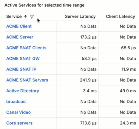
Columns with filters applied have a blue funnel displayed next to the column title.
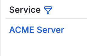 |
To remove the filter, click the blue filter  and then click Clear filter.
4.2.4. Compare metrics in the graph
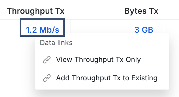
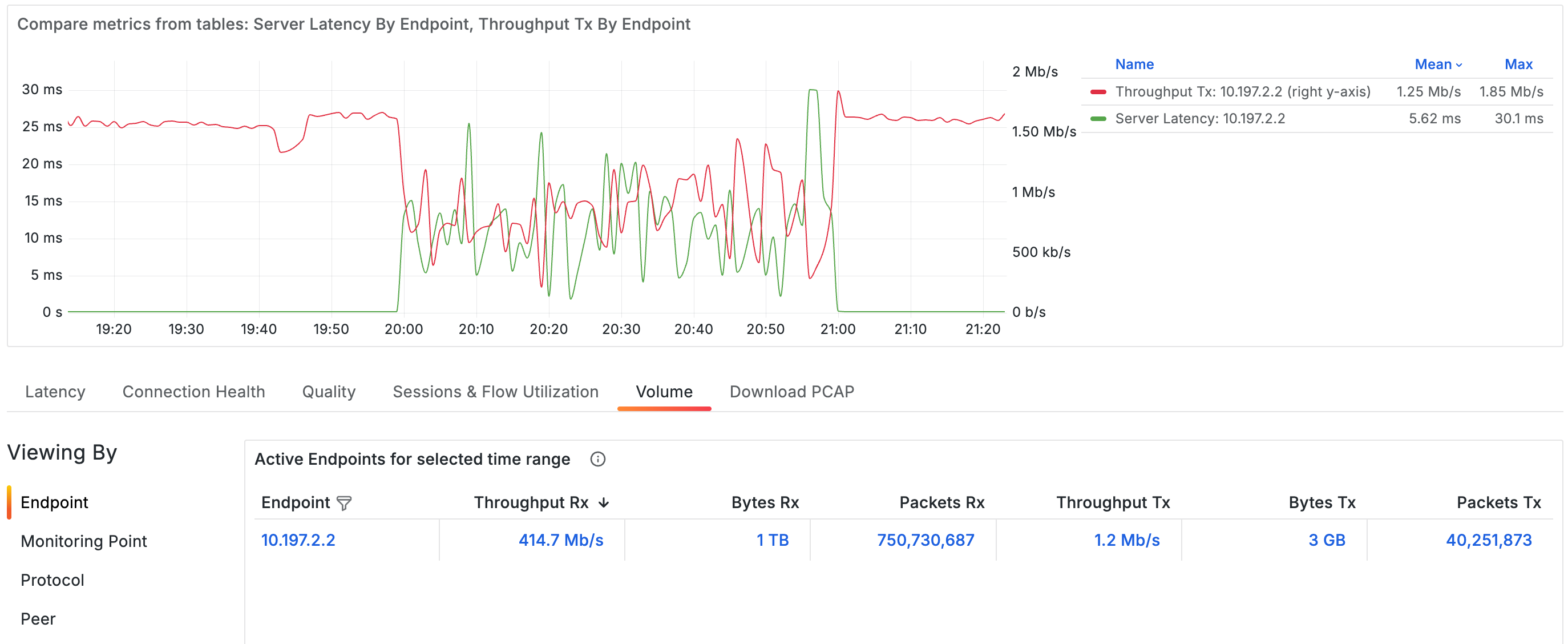
Metric values in the table act as data links that control what appears in the graph. You can use these links to display and compare multiple metrics in the same graph.
Clicking a metric value opens two options that include the name of the selected metric.
View Only replaces the current graph with that metric.
Add to Existing adds the metric to the graph alongside the metrics already displayed.
Clicking a metric value opens data link options.
 |
Metrics from different metric groups and different Viewing By selections can be added to the same graph, allowing you to compare related metrics across multiple views without leaving the dashboard.
Metrics added from the table appear together in the graph for comparison.
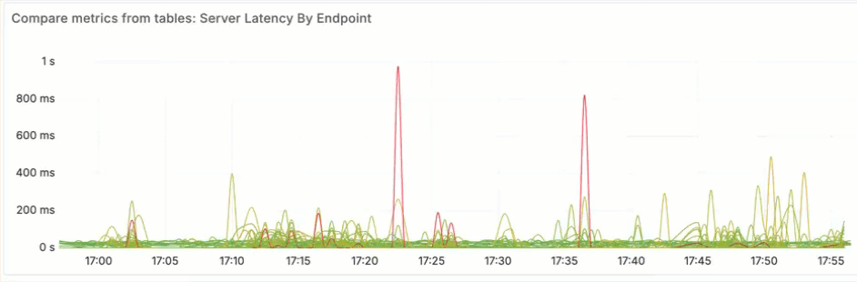
4.2.5. Analyze metrics in the graph
Use the graph and legend to examine metric behavior over time and compare multiple metrics.
Zoom in on a custom time range
To zoom in on specific metric activity, drag across a section of the graph. This creates a custom time range that is applied across the whole dashboard. Once you've selected a time range, it will remain in effect until you intentionally change it or navigate to a new dashboard.
Filter metrics using the legend
Use the legend to isolate one or more metric series in the graph.
Click a series label to isolate that series. All other series are hidden, and the vertical axis rescales.
To display additional series, press Ctrl or Command and click each series label you want to add. To return to the default view that shows all series, click any series label twice.
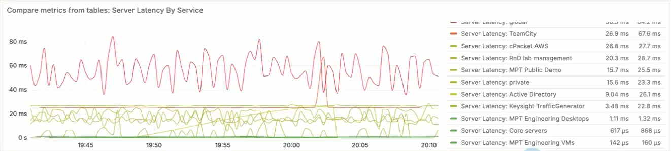
Sort legend values
Click a column header to change the sort order. Each click cycles through the available sort options: default, ascending, and descending.
 |
Change a series color
By default, series colors are assigned automatically based on the value range of the metric. You can change a series color to make it easier to distinguish metrics in the graph.
In the legend, click the color bar next to the series.
In the color selector, choose a preset color in the Colors tab or define a custom color in the Custom tab using the picker or RGB values.
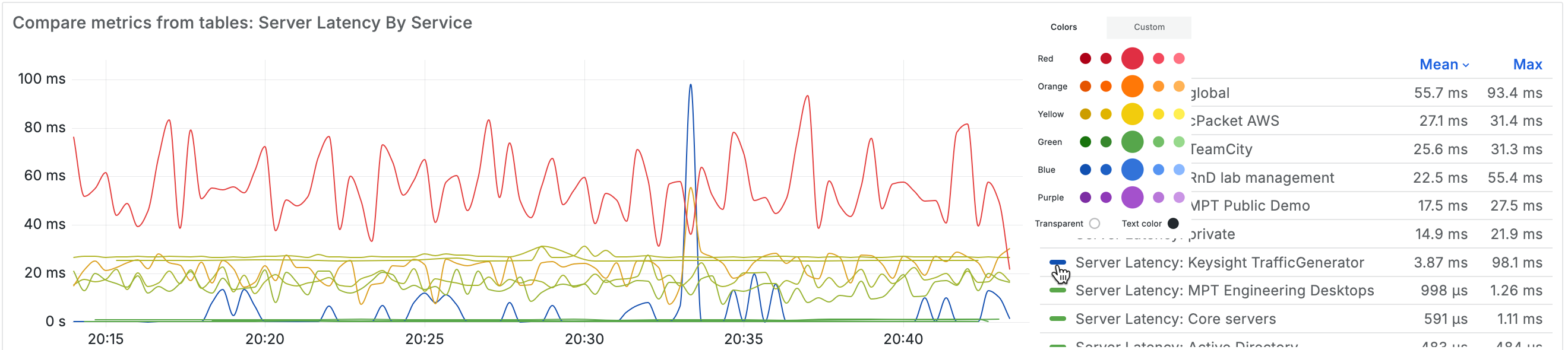
Colors are applied to the current view only and are not preserved when you switch dashboards or metrics.
4.2.6. Navigate to related dashboards
Direct navigation links open related dashboards for the selected value. For example, choosing an endpoint opens the Endpoint Detail dashboard for that endpoint.
The current context, including the selected time range, is preserved when navigating.
When viewing by Peer, data links provide additional navigation options. You can open either the related Detail dashboard or a Conversation dashboard for the selected pair.
 |