5.2. Detail dashboards
Detail dashboards focus on a single service, location, monitoring point, protocol, or endpoint, providing more granular metrics and additional context for deeper analysis.
Dashboard structure
Each Detail dashboard includes:
Details panel
Key metrics
Time series graph
Metrics table
The details panel displays identifying information for the subject of the dashboard. The key metrics provide a quick view of top values across the selected time range. The time series graph displays selected metrics over time for comparison and correlation. The metrics table presents detailed data organized by metric group.
Each dashboard opens with a metric displayed in the time series graph.
Service Detail, Location Detail, Monitoring Point Detail, and Protocol Detail dashboards display Server Latency by endpoint.
The Endpoint Detail dashboard displays Server Latency by monitoring point.
Metric groups
Metrics in the table are organized into predefined groups such as Latency, Connection Health, Quality, Sessions and Flow Utilization, and Volume. Select a tab to change the metrics shown. For a complete list of metrics in each group, see Metrics by group.
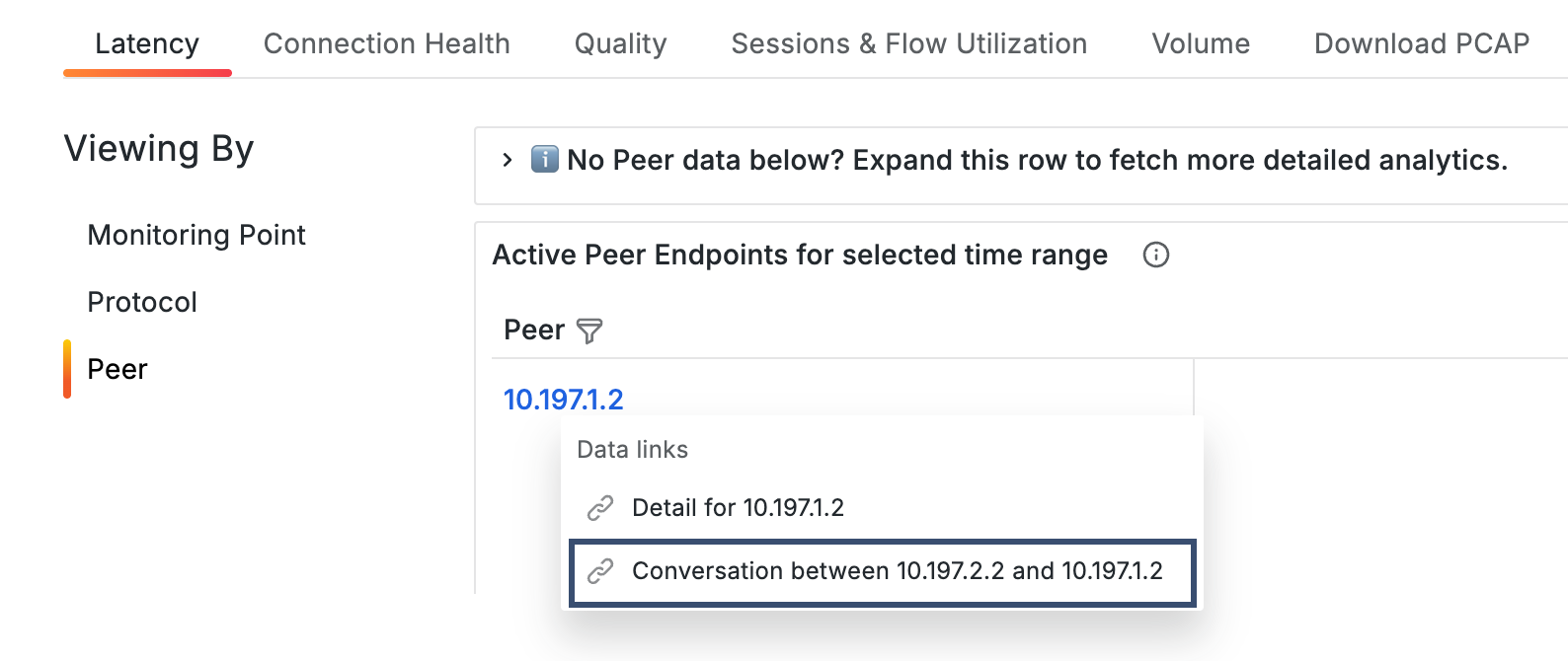
Viewing By selector
The Viewing By selector changes the perspective of the metrics in the table. Depending on the dashboard type, you can view the same data across different dimensions, such as endpoint, service, location, monitoring point, protocol, or peer.
When viewing the Endpoint Detail dashboard by Peer, an on-demand analytics panel appears if peer data has not yet been collected for the selected time range. This panel is specific to the Endpoint Detail dashboard and does not appear in other Detail dashboards. See On-demand analytics collection.
Table actions
Values in the metrics table provide navigation and context-specific actions.
Direct navigation links
Values in the first column open related Detail dashboards. When viewing by Peer, selecting a value provides additional options, including navigation to Conversation dashboards. See Navigate to Conversation dashboards.
Data links
Provide context-specific actions based on the selected value. Depending on the context, you can:
Add or change metrics in the time series graph for comparison. See Compare metrics in the graph.
Open related dashboards, including Conversation dashboards. See Navigate to Conversation dashboards.
The current context, including the selected time range, is preserved when navigating between dashboards.
Download PCAP
Use the Download PCAP tab to retrieve packet capture data for a specific endpoint or time range. To learn more, see Download PCAP.
Layout and components
The following example shows a Service Detail dashboard with its primary components.
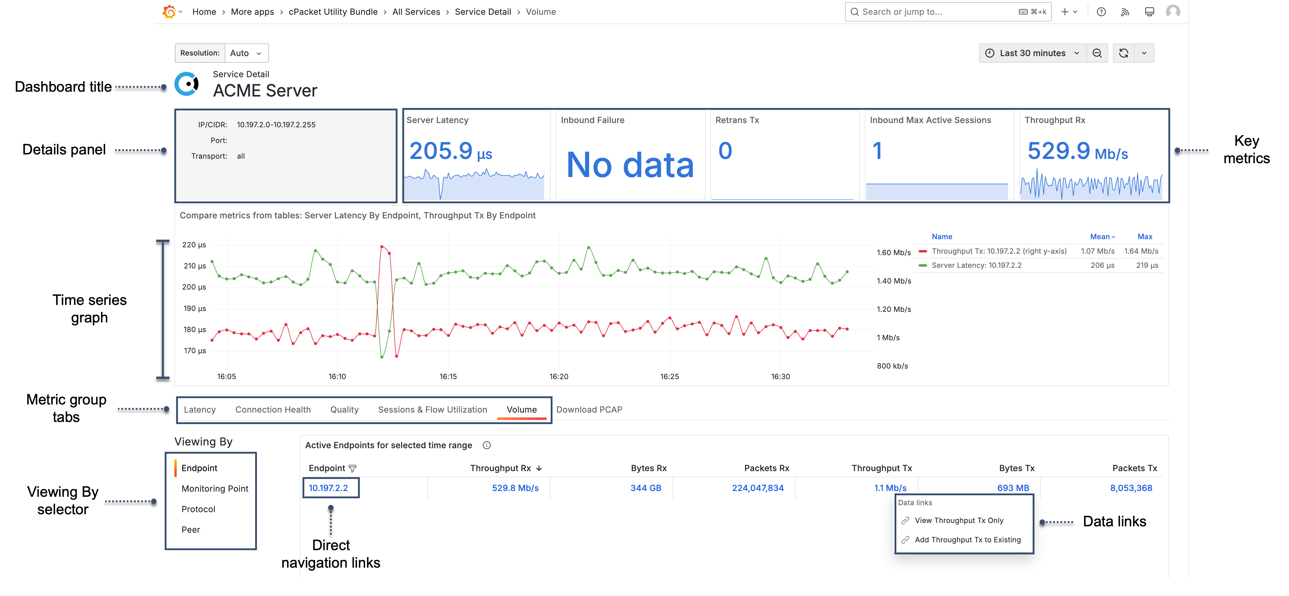
- Dashboard title
Identifies the subject of the dashboard, such as the selected service, location, monitoring point, protocol, or endpoint.
- Details panel
Displays identifying information for the endpoint, service, location, monitoring point, or protocol being analyzed. Content may include IP addresses, ports, transport protocols, or VLAN settings.
If you do not have sufficient permissions, this panel displays a message indicating that cClear analytics > read permissions or higher is required.
- Summary metrics
Show key performance indicators for the selected time range. Each metric includes a spark line showing the trend for the selected time range.
- Time series graph
Displays selected metrics over time for comparison and correlation.
- Metric group tabs
Metrics are organized into predefined groups, such as Latency, Connection Health, Quality, Sessions and Flow Utilization, and Volume. Selecting a tab changes the metrics shown in the table.
- Viewing By selector
Changes the perspective of the metrics in the table, such as by endpoint, service, location, monitoring point, protocol, or peer.
- Direct navigation links
Values in the first column open related Detail dashboards.
- Data links
Provide access to context-specific actions from the metrics table.
5.2.1. Navigate to Conversation dashboards
Access Conversation dashboards from Detail dashboards when the Viewing By selector is set to Peer.
When viewing data by peer, selecting a value in the table provides additional options, including opening a Conversation dashboard for the selected pair.
Conversation dashboards display detailed metrics for traffic between two specific peers, allowing you to analyze interactions at a more granular level.
 |