Workflow dashboard layout
The Observability workflows are a series of interconnected dashboards that share a common dataset. Each dashboard consists of multiple panels that visualize data in different formats, including a time series graph, a legend, and a table containing tags and metrics.
The primary body of each dashboard consists of two main visualization panels:
Graph: This panel visualizes selected metrics over a specified time period and resolution. It provides a visual representation of how the metrics change over time, helping you identify trends, anomalies, or specific events.
Table: This panel contains tags and metrics that categorize and filter data within the dashboard using data links. Each tag also contains data links to other dashboards in the workflow.
Overall, the workflows provide a multi-dimensional view of system performance, with various ways to navigate and filter the data for more detailed analysis.
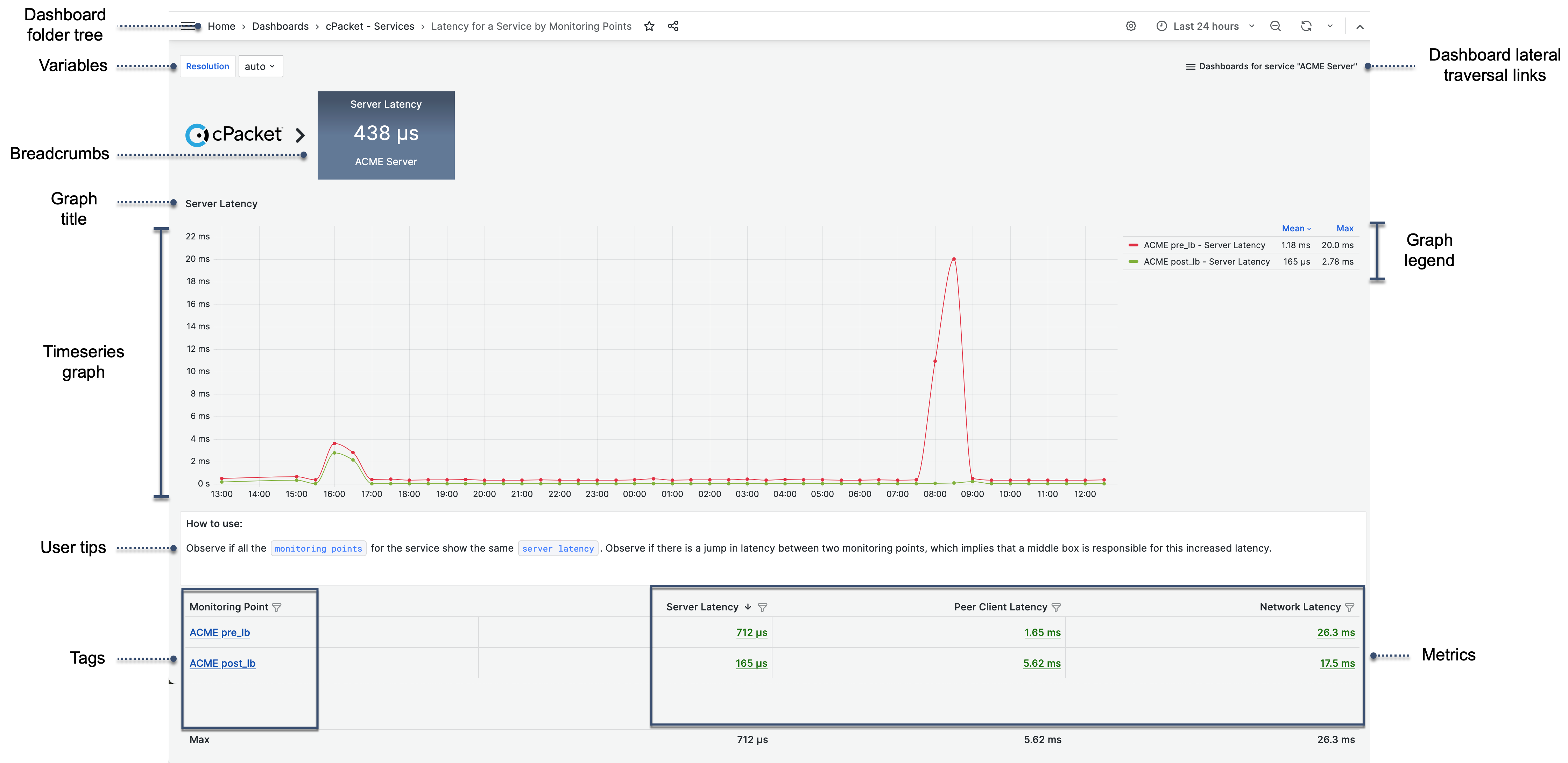
- Dashboard folder tree
The Dashboard folder tree displays the current dashboard title and the hierarchical dashboard folder structure, with the topmost folder to the left. The currently displayed dashboard is grayed out and shown to the right. You can navigate the folder structure by selecting a dashboard folder title.
- Variables
All dashboards have a Resolution variable that updates the granularity level of queries using a time-series format, like those found in the graph queries. More detailed troubleshooting dashboards at levels 3 and 4 have additional variables.
- Dashboard lateral traversal links
The top right corner of some dashboards contain a pull-down list
 of related dashboards that apply to the same context. These dashboards are at the same hierarchical level and allow you to move laterally across the workflow, providing a more comprehensive view of the system's performance.
- Favorites
The star
 toggles whether or not the dashboard is shown as a Favorite on the Dashboards home page.
- Breadcrumbs
The workflow breadcrumb displays the tag, metric name, and metric value you selected from the preceding dashboard level in the workflow. Click on this metric to navigate back to the previous level, providing a way to move up and down the workflow hierarchy.
- User tips
A text panel is located between the graph and table, which offers useful usage tips, definitions, and links to additional metrics on the Level 3 and Level 4 Troubleshooting dashboards.
- Graph title
Displays the metric being shown.
- Time series graph
This is a visual representation of the metric values over a defined time span based on selected tags and metrics. As values go from low to high, the graph color transitions from green to yellow to red. The color scheme visually represents data based on its value relative to the minimum and maximum values of a field or series. The maximum value in your data range will be assigned the color red, and the minimum value will be assigned the color green. Any values that fall between the maximum and minimum will be assigned a color that lies between green, yellow, and red, depending on where they sit in that range.
- Graph legend
A set of metrics next to the graph for the values plotted on that graph. Each series in the graph is represented in the key by a same-colored swatch.
- Table
The table displays the tag and metric values. The Overview, Level 1, and Level 2 dashboard tables have one tag and six metric columns. Level 3 and Level 4 Troubleshooting dashboards have additional tag and metrics columns. Tag column text is displayed in blue, and the metric columns are in green. The colors are for visual distinction and do not carry any intrinsic meaning related to the data values.
- Tags
Tags are indexed key-value pairs in the InfluxDB data structure that record metadata. They are used in the dashboard table to categorize and filter data.
- Metrics
Metrics are data points that are tracked over a specified time interval.